Spark is a conceptual website that aims to provide an enjoyable and user-friendly experience for people shopping for electric cars. It’s 2023, and there isn't a website for shopping for electric cars that offers a pleasant and user-friendly experience. Instead, existing websites tend to have confusing and outdated user interfaces. Spark aims to fill this gap by simplifying the process and making it easy for users to find the electric vehicle they are looking for.
Competitor analysis
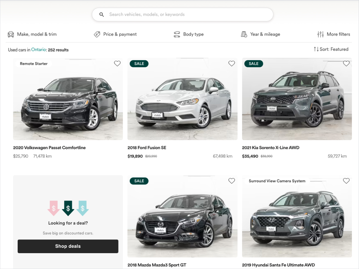
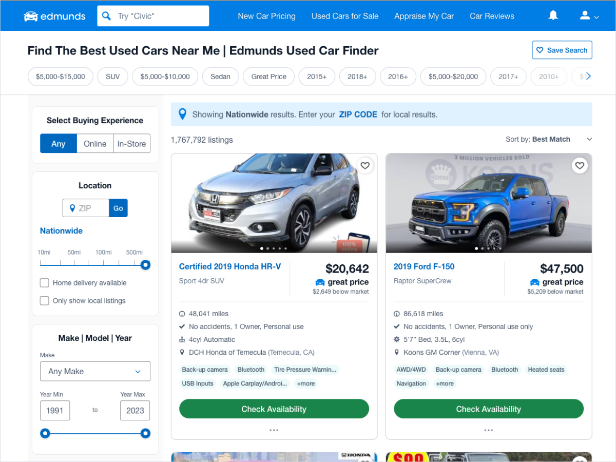
To create a better website, I conducted a competitor analysis, evaluating similar websites. By examining what works and what doesn't work in the current market, I gained valuable insights and ideas for designing a better website.
Insights
- Websites are either information-heavy or more minimal with much less info.
- For vehicle images, some websites opt for larger, more square images, while others use smaller images.
- Many websites use a sidebar on the right side of the screen to display the search filters.
Creating the design system
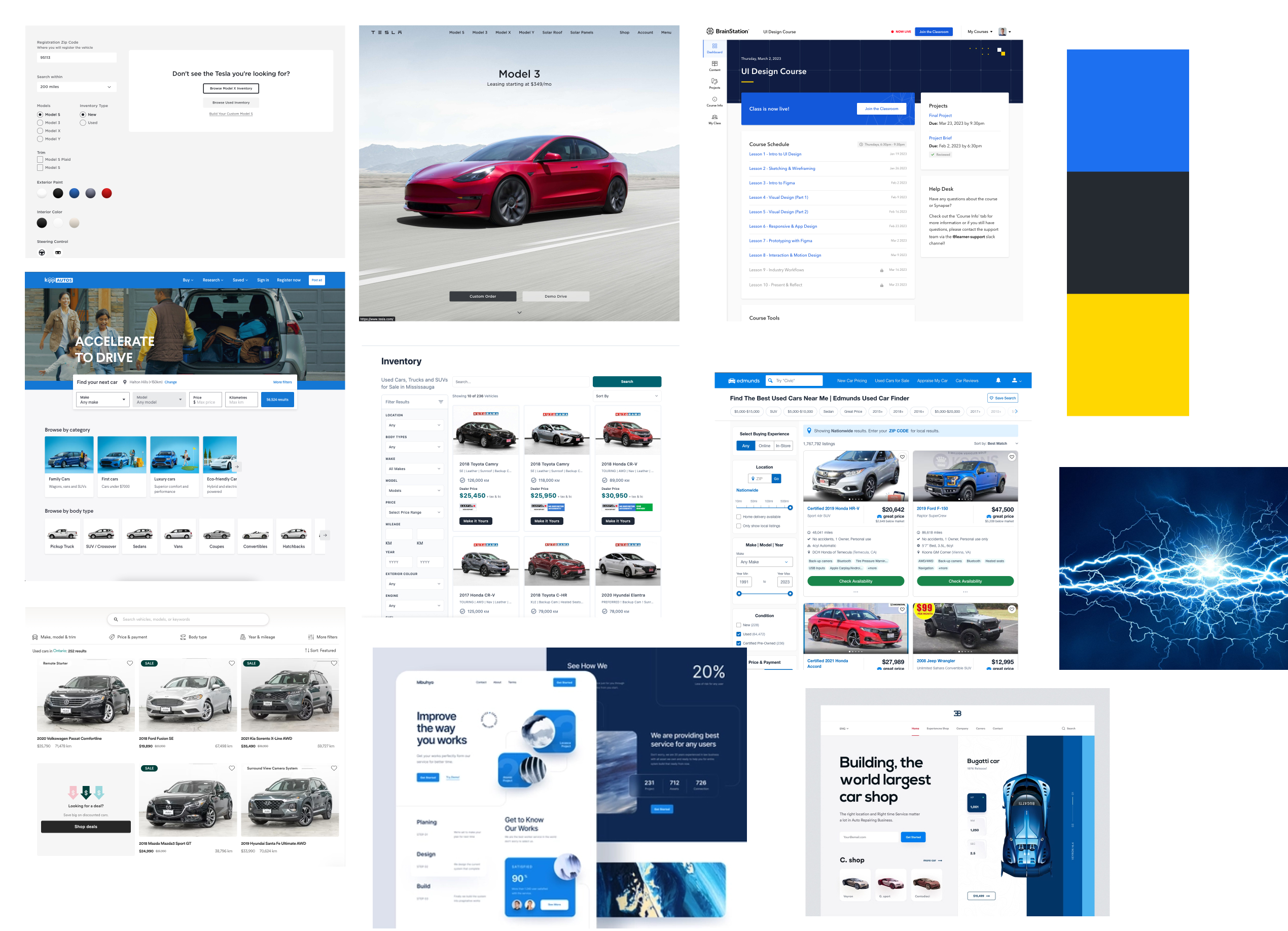
To achieve the desired feel of the interface, I used different shades of blue as the primary colour, along with bluish greys that share a similar hue to the primary colour. While brighter and warmer colours like orange, red, and green are popular in the market today, I chose blue because it conveys a sense of calmness for the user. Before I started building the design system, I took some looking for inspiration. Below are some other websites and other images that have a similar feel to what I was going for:
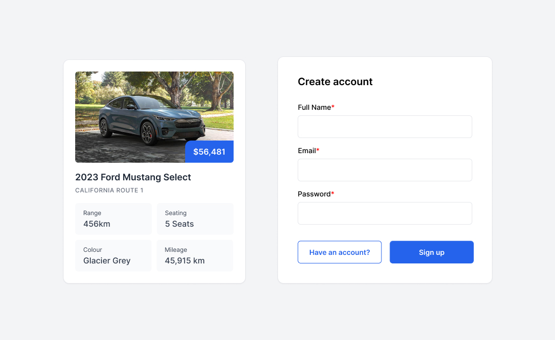
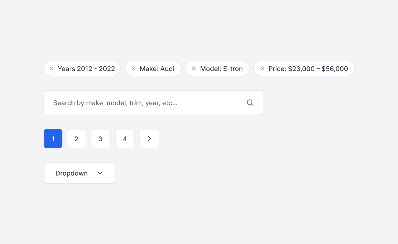
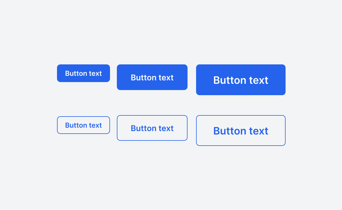
Components
Below are a few components that are part of the design system. You'll notice the components have a less rigid look and feel compared to similar websites.
Sketches & Wireframes
I designed three main screens: the marketing page, the search page, and the vehicle details page. These are the three most important screens. Below are the initial sketches and ideas I had for Spark. I wanted to make the interface as intuitive as possible and to achieve this I used website industry standards for layout to keep things familiar to the user.
Final designs
Below are the final designs for mobile and desktop screen sizes.