Bitwarden is a popular open-source password manager used by millions. While it functions well, its mobile, web, and desktop interfaces appear visually outdated. I think their service is good, but the overall experience could be vastly improved by modernizing the design of all their apps. For this side project, I'll be redesigning the website with the goal of enhancing the overall user experience and also adding some new useful features.
Updates and additions
For this project, I will be changing the typeface, redesigning the navigation, and adding new features, such as quick actions.
Typeface
Changing the typeface of a product can make a big impact on the overall feel. For Bitwarden, I changed the typeface to Inter, a modern sans-serif font that works great for this type of interface.
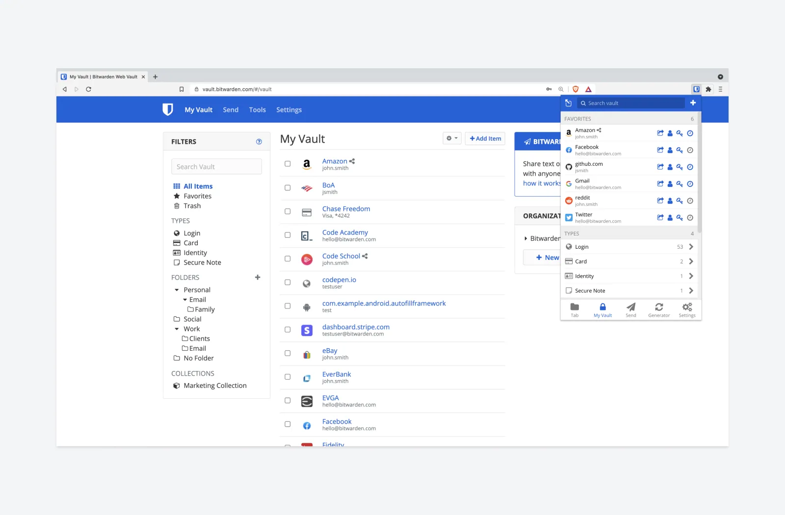
Navigation
The current design uses an outdated sidebar design. Because of this, there's a lot of empty whitespace being underutilized. In the updated design, I moved the floating sidebar to the left and can now utilize some horizontal space for each item that was just empty whitespace before.
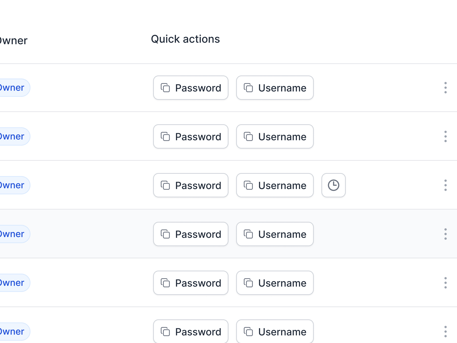
Quick actions
It takes about two clicks to copy a username, password or authentication code in the current design. In the new design, I added "Quick actions", where you can easily copy passwords, usernames, and authentication codes in one click without selecting any dropdown menus. It's the little things like this that can make a product much better.
Redesigning the components
I redesigned all the main components and added some roundness to buttons, checkboxes, and other items to make the interface look more modern. To help make the interface more uniform, I also put each login icon into its own container with a border.
Completed design
Below is the Figma file with the completed design. Overall, I'm happy with how the design turned out. I think it would be interesting to hear what users think about this design update and get feedback on what else could be changed to make the web app even better.